We recently explored the challenges around creating coherence across large scale landscapes, such as the King Charles III England Coast Path. We’ve asked: how can wayfinding help people build a consistent mental map while allowing every destination to retain its own identity?
It’s a theme that comes up in our work again and again, and this month we’re exploring identity within a single local authority area.
Metropolitan boroughs are comprised of numerous different towns rather than one central town or city. That inevitably brings the potential for competing local identities.
How do you celebrate what makes one town different from another, while ensuring they still feel like part of the same borough?
It’s something that Tameside, where we’ve been spending time recently, is particularly aware of. We’re helping the Council develop a borough-wide brand identity that’s both unique and unifying.
It's a fascinating challenge, and one that sits at the heart of successful placemaking.
We often talk about the DNA of a place.
Every town has its own character - a unique combination of history, landscape, architecture and community. Sometimes those stories are obvious: a mill town proudly wears its industrial heritage, and a market town still revolves around its historic square. Elsewhere, the clues are hidden in street names, waterways or the traditions upheld by locals.
Understanding those stories is where every project begins.
Before we think about colours, graphics or sign families, we like to walk the streets, observe how people use the space, look at its landmarks and speak to the people who know it best.
Working across several towns introduces another dimension.
A borough should feel coherent, especially from a visitor's perspective. Yet at the same time, each place must retain its own personality. Just as towns and villages along a coastal path need a sense of consistency without uniformity, so, too, should a borough’s towns and villages.
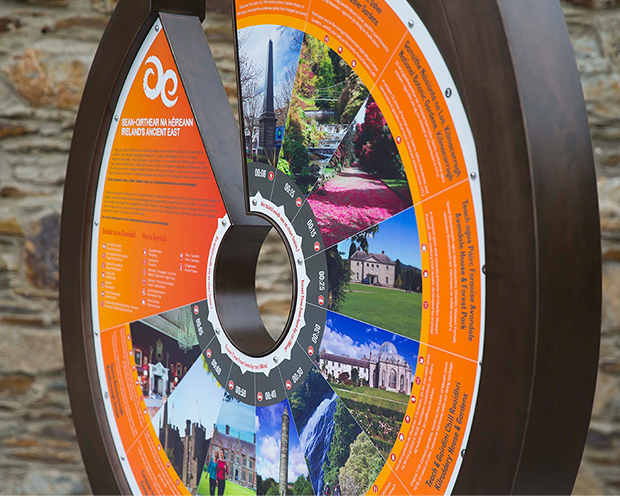
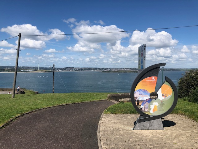
A wayfinder’s role is to uncover the common threads that tie places together. These discoveries are then translated into a visual language that people can recognise and understand. Our work creating a visual brand for Ireland’s Ancient East took references from the landscape to develop an iconic sign family that brought together themes from Ireland’s southern and eastern regions.
Place branding is sometimes mistaken for creating something new, but the reality is that the best place brands uncover rather than invent a place’s identity.
The identity of a place isn't something you can impose: every town already has a distinct identity, shaped over generations by its people, history, landscape and architecture. The role of place branding is to understand those characteristics, clarify them and express them consistently so that they're easier for people to recognise and experience.
Wayfinding plays a crucial role in expressing that identity, guiding people between destinations while revealing the stories that make a place memorable.
Once we've uncovered what makes a place special, the next step is translating those stories into something people can experience.
Coherence in design comes from establishing shared principles around typography, information hierarchy or materials so people recognise they're within the same wider family of places. Then within that framework, each town has the freedom to express its own character.
Sometimes that's achieved through bespoke iconography inspired by local landmarks. Sometimes it's found in the patterns, materials or colour palette of a sign family. Elsewhere, interpretation reveals forgotten stories or celebrates the people and events that have shaped a place over generations.
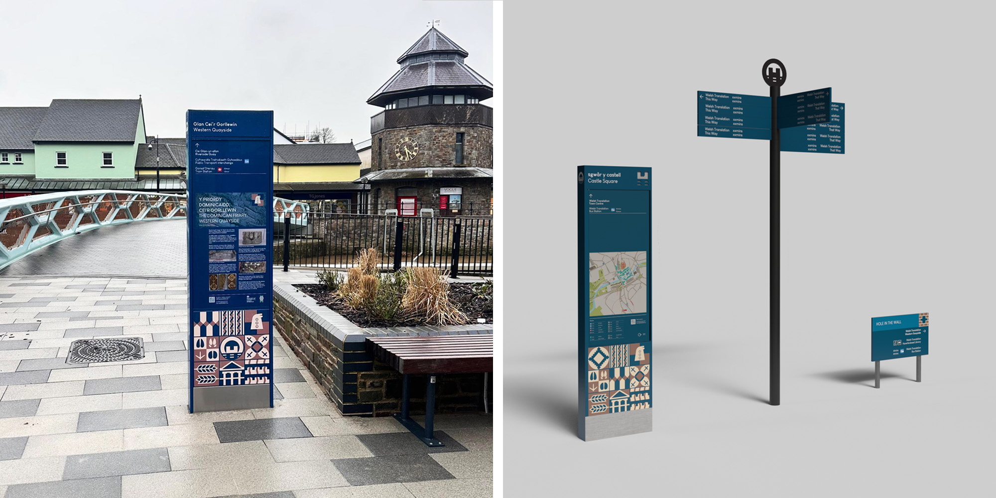
Our projects each respond differently. In Haverfordwest, the tiles tell stories. We used bespoke graphic tiles to share the town’s stories using a local colour palette to reinforce the town's identity.
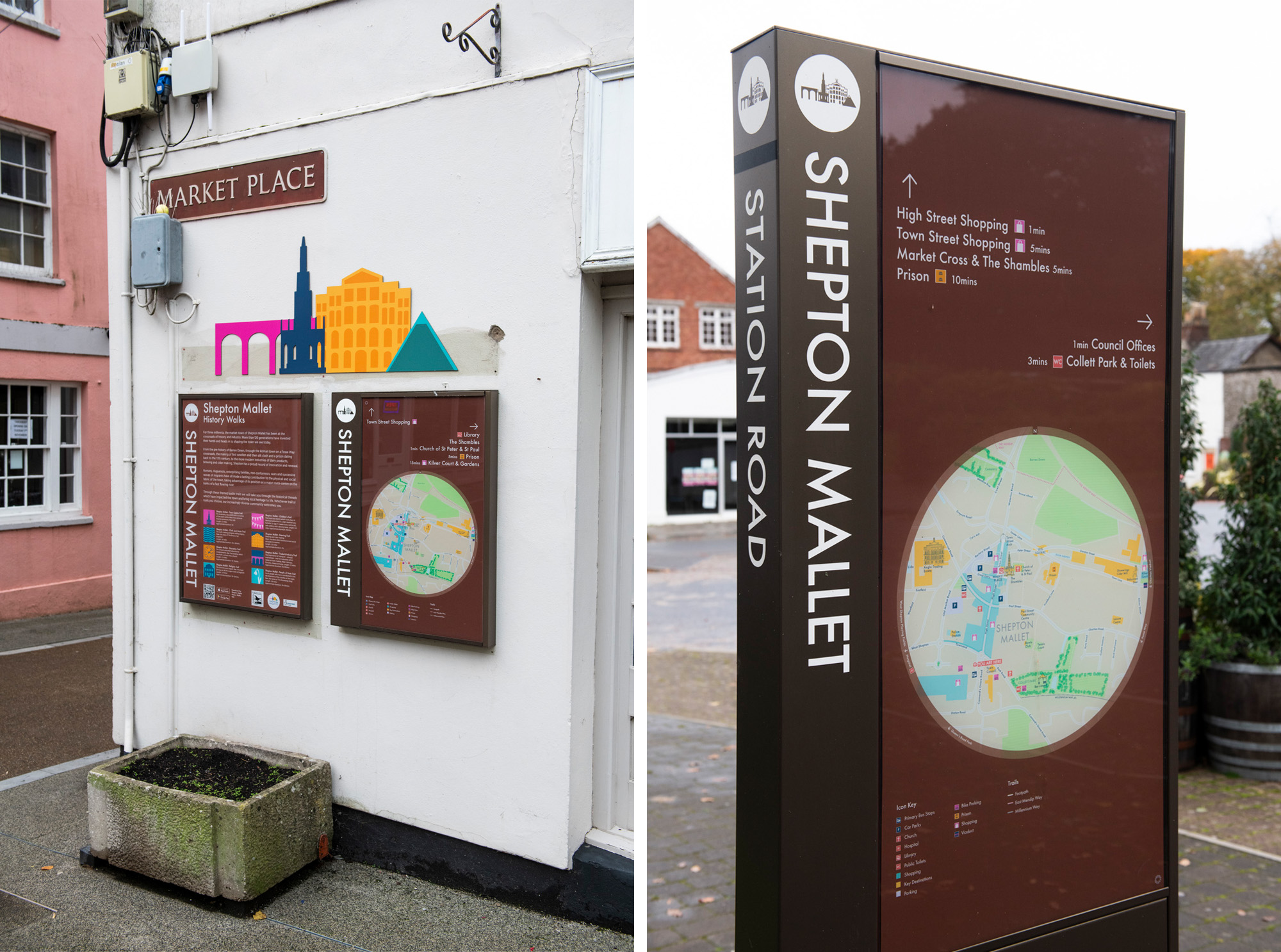
At Shepton Mallet, a family of colour-coded icons celebrated local heritage while making information easier to understand.
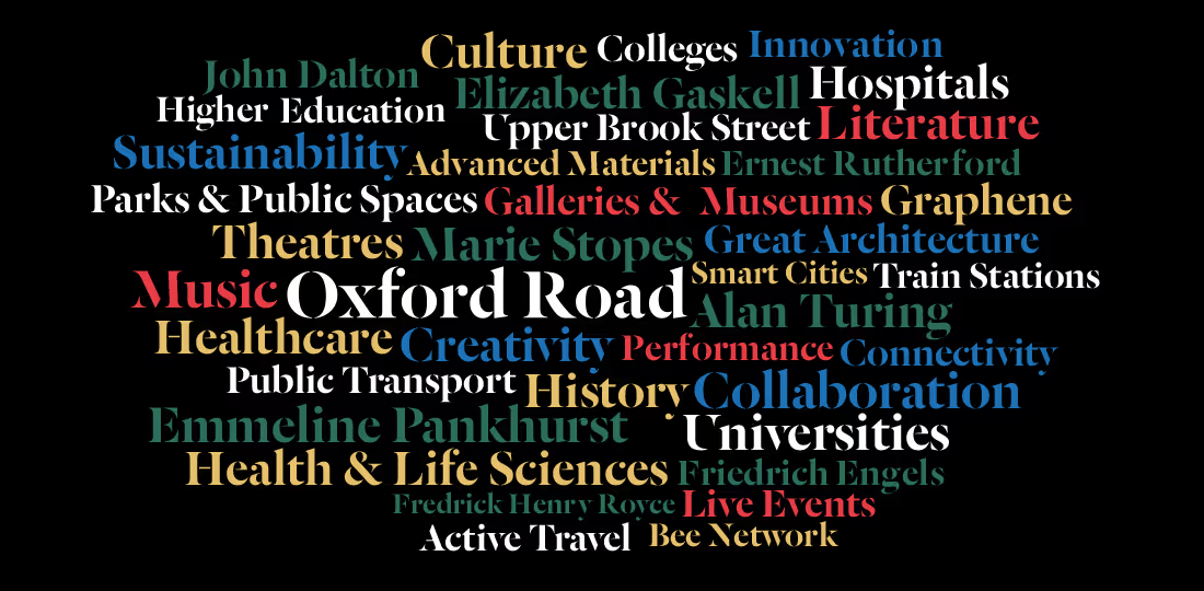
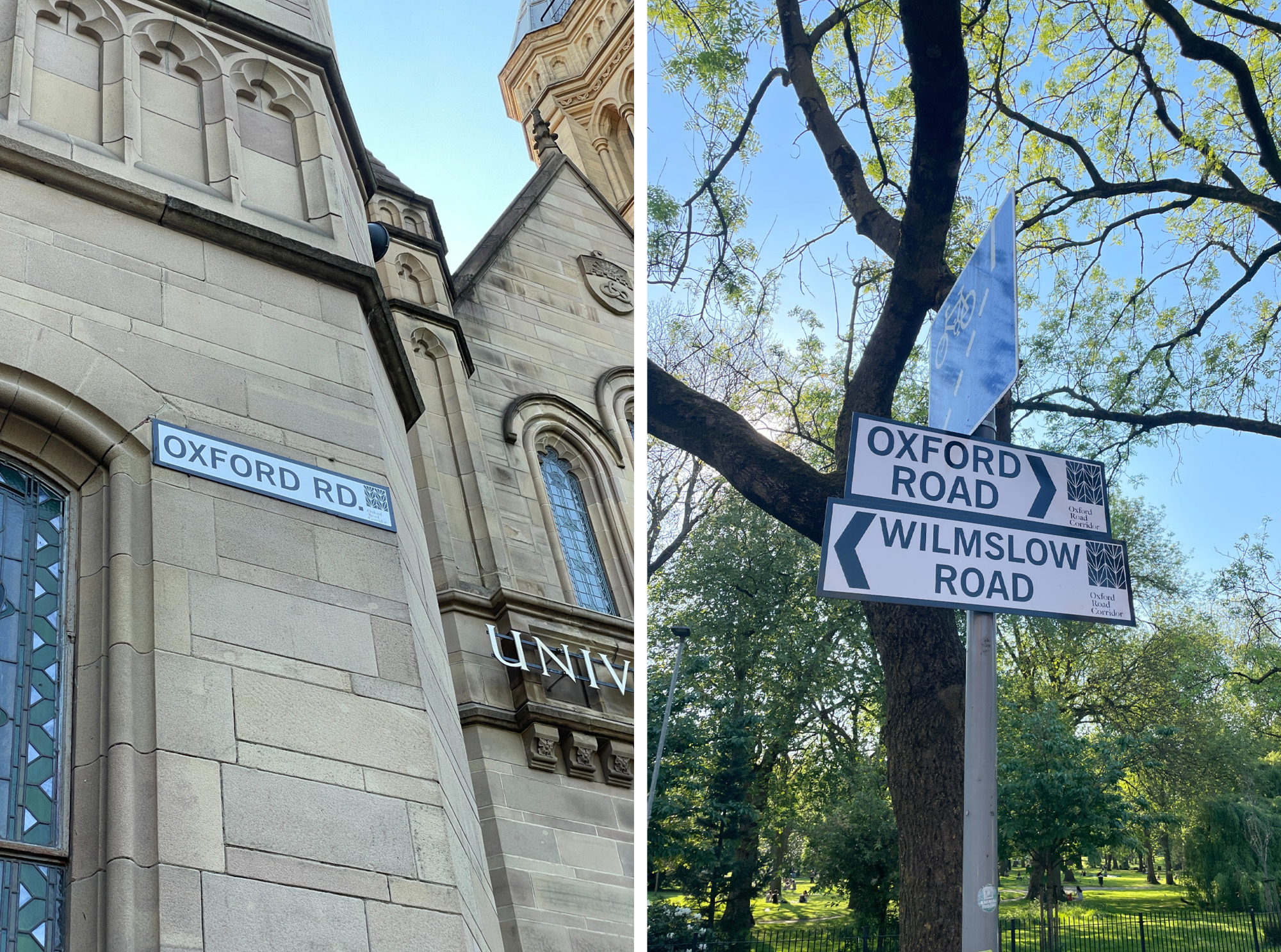
Along Manchester’s Oxford Road Corridor, we developed a coherent visual language for Manchester’s Knowledge Quarter, including a distinctive icon that became a recognisable marker throughout the corridor.
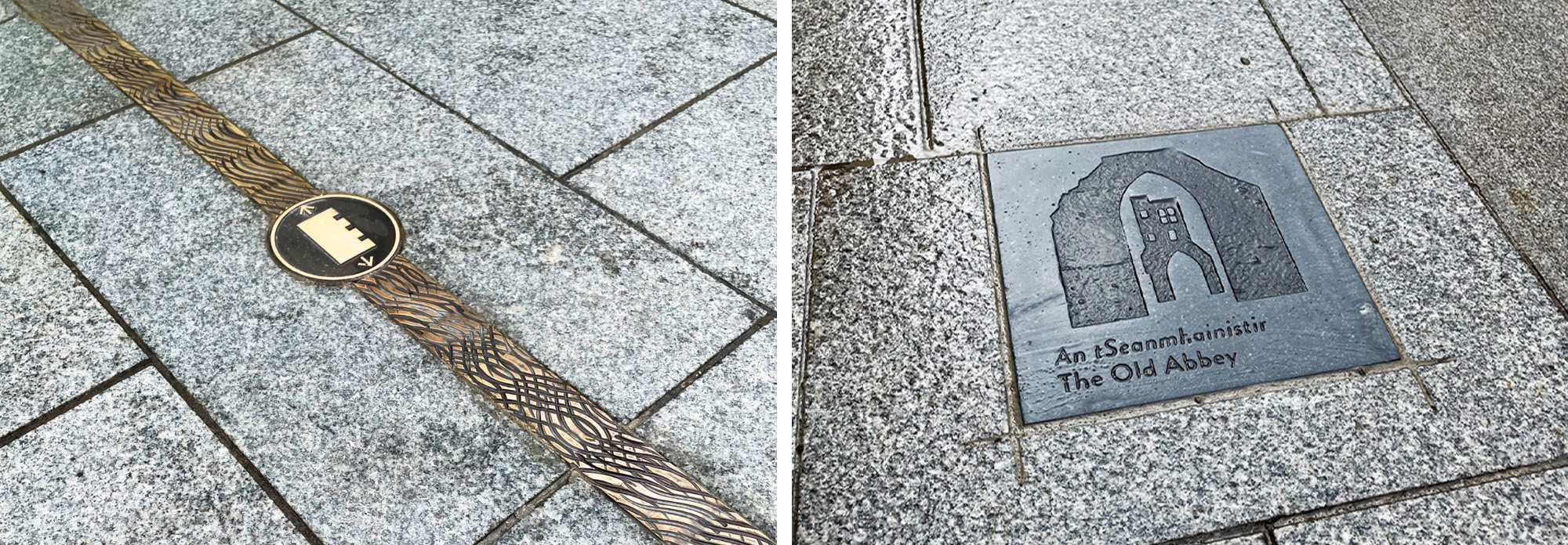
Drogheda's wayfinding incorporated 70 paving stones engraved with historic facts and 43 bronze inlays along key historic routes, uniquely reinforcing the town’s rich heritage.
In every case, the design solutions differ, because the places themselves differ.
As we develop our concept for Tameside, we’re remaining focused on the fact that, when we get the balance right between celebrating unique identities and creating visual coherence, the whole area becomes more memorable.
Whether we're working across a national trail, a university campus, a new neighbourhood or a family of town centres, the challenge remains remarkably consistent: creating coherence while allowing every place to tell its own story.
People remember places with character. Our role is to uncover that character, express it thoughtfully and make it easier for people to discover along the way.