Southall Waterside is the ultimate brownfield infill site: an awkwardly shaped former gasworks in West London bounded by railway lines, the Grand Union Canal and existing housing.
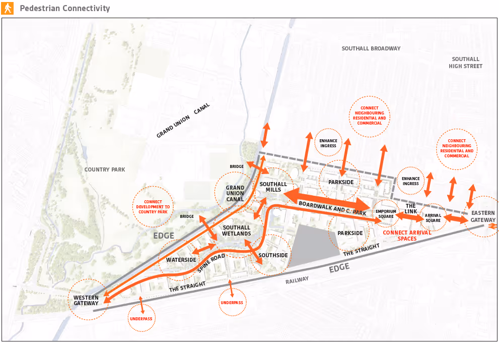
That meant that ingress into the 45 hectare site were limited, further exacerbated by narrow entrances and challenging level changes. Navigation into and within the site did not have many natural cues.
As is usual for large scale regeneration schemes like this, the development (comprising 3,750 homes plus a range of leisure and commercial uses) would be developed out in phases.
Our role as part of the masterplanning team was to create a strategy for helping users navigate the new neighbourhood as it was built out over a ten-year period.
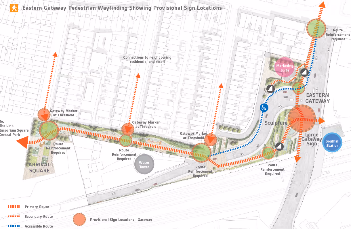
Following our initial analysis to understand the site’s challenges and opportunities, we devised a wayfinding scheme that would help reinforce the masterplan’s gateways, key routes and character areas.
The scheme improved ingress from the northern site boundary, as well as creating new links across the Grand Union Canal into the county park beyond. This gave the opportunity for the design team to bring green infrastructure – including wetland areas – into the development.
Using the masterplan, our wayfinding strategy reinforced the street hierarchy, starting with the Eastern Gateway and the central “Boardwalk” east-west spine road, and moving westwards towards the canal and into the residential neighbourhoods.
With the Eastern Gateway linking into the new Elizabeth Line (Cross Rail), there was plenty of opportunity to improve movement here to create a really liveable neighbourhood.
Our strategy created clear hierarchies for pedestrian movement across the regeneration site, all aimed at reinforcing key routes and giving confidence to pedestrians and other active users to explore further.
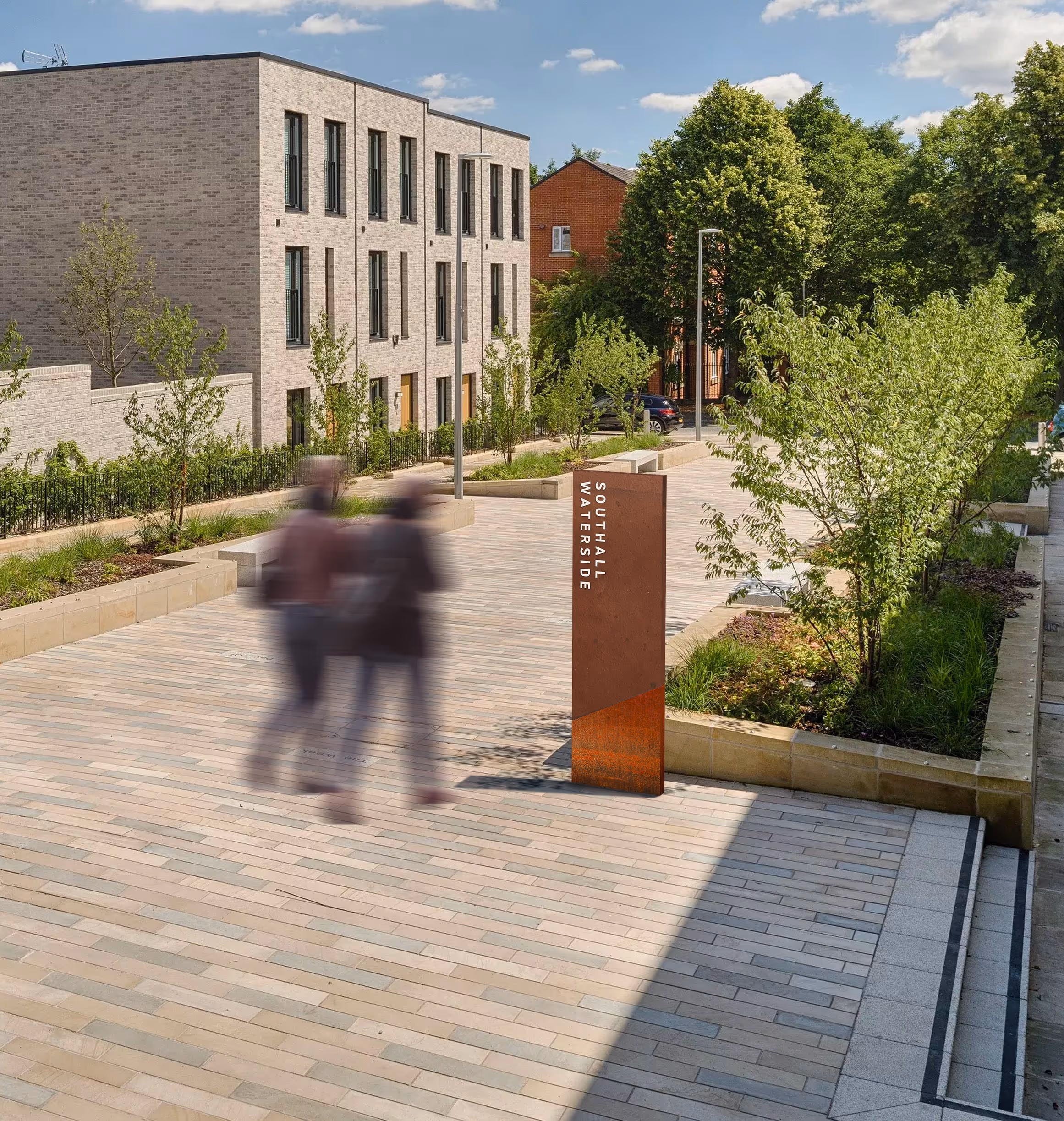
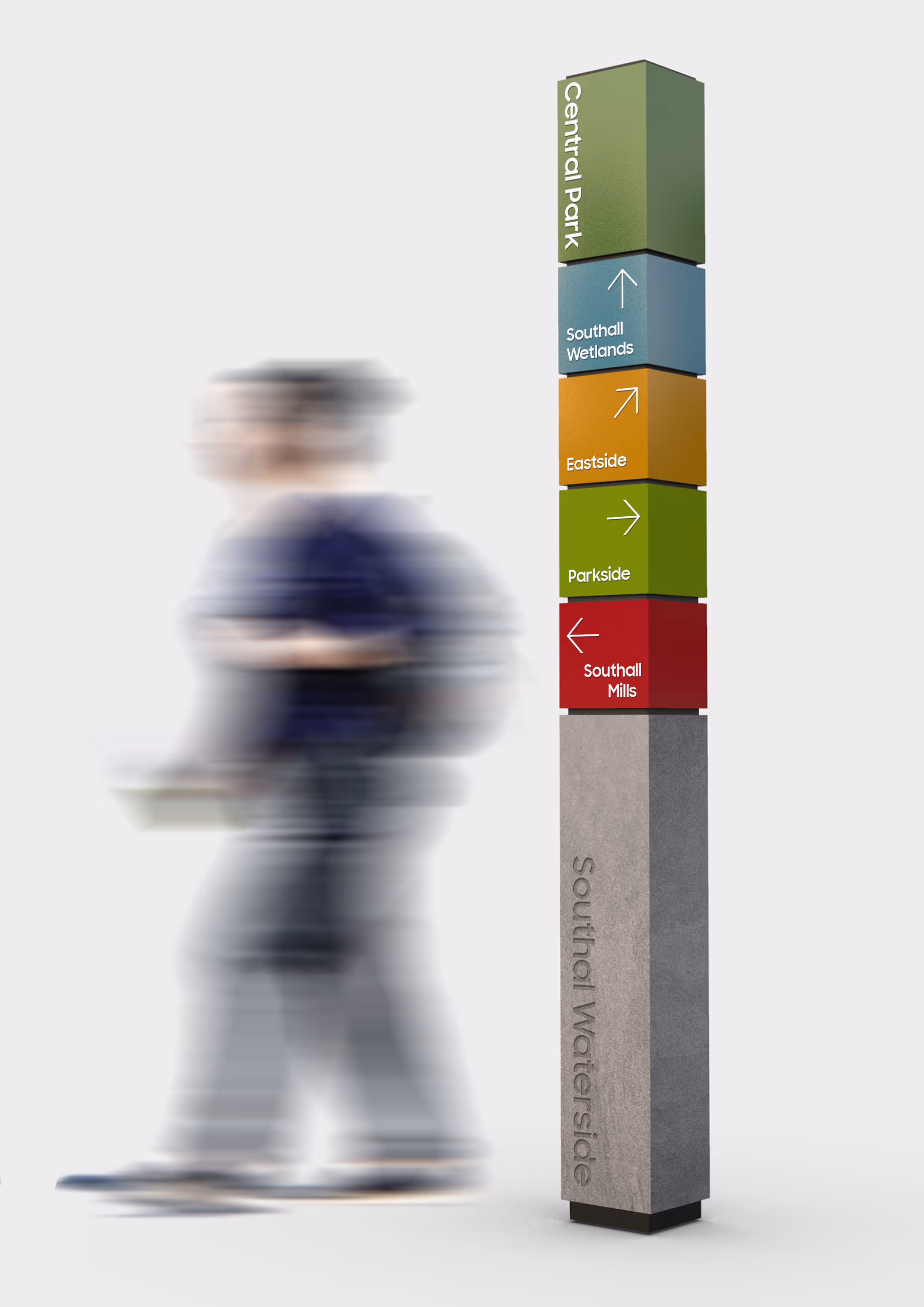
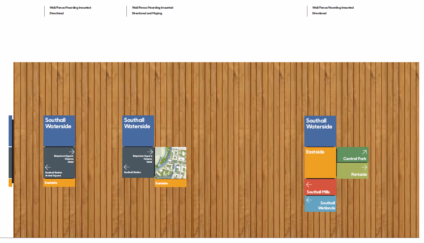
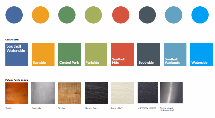
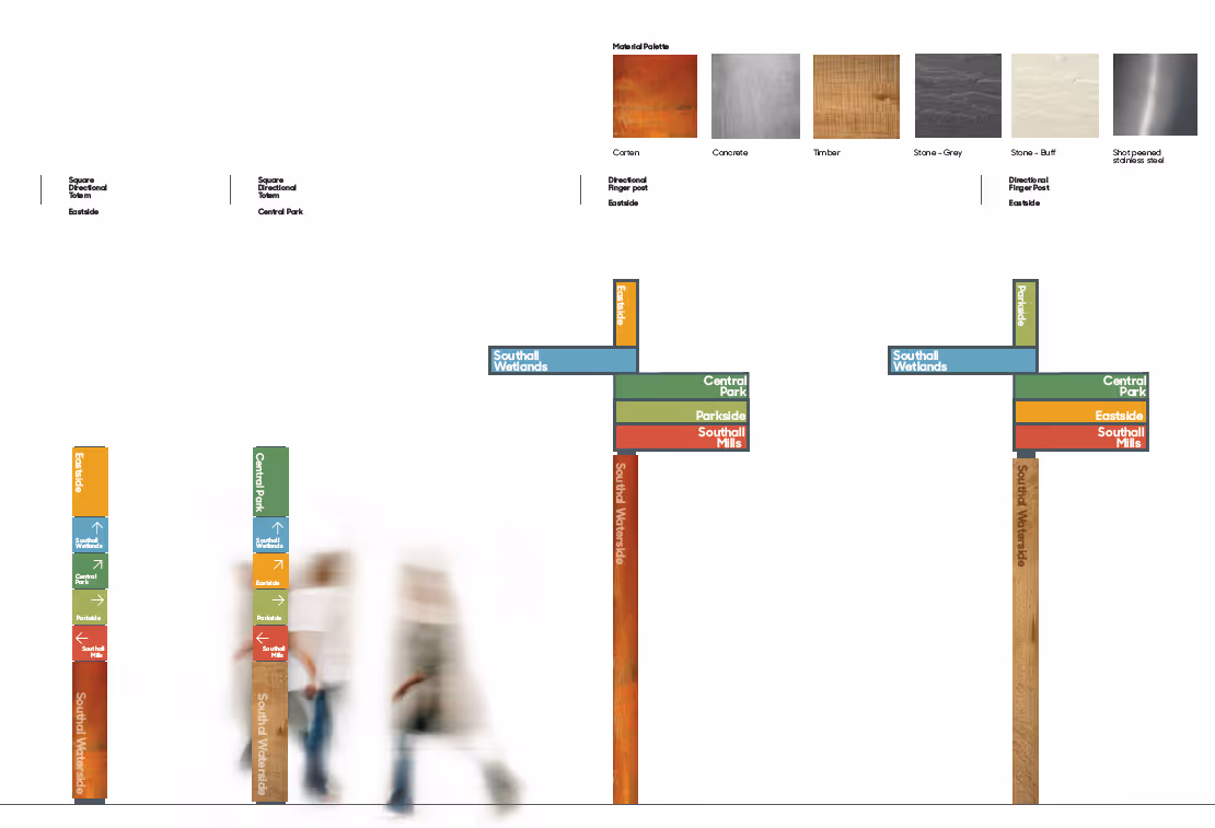
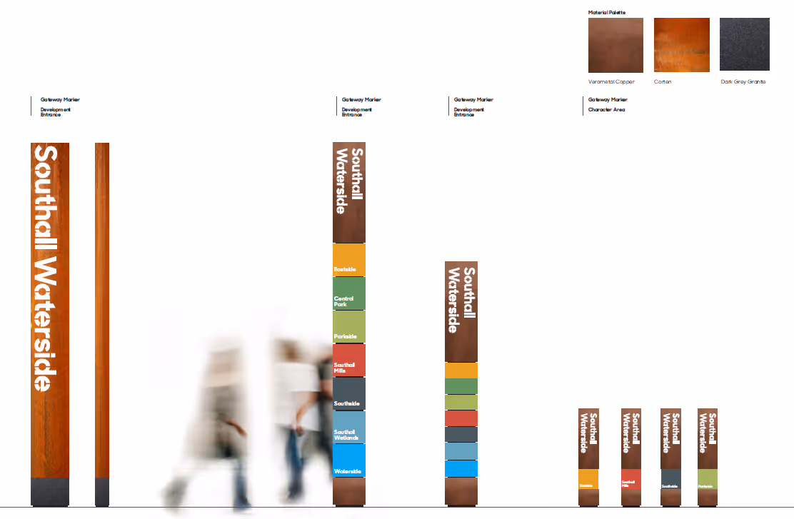
Using maps and colour codes, we developed a system which could be updated easily with printed vinyl on glass. All signs, whether totems, finger posts or information boards, corresponded with the colour code for that neighbourhood, supporting orientation, leading the visitor on and improving user experience.
Sign bases were of Corten steel – a nod to the site’s industrial past, or timber – for the more natural character areas.
Colours also denote which character area the user is in, helping to orientate.